Simple, Themeable, Customizable React UI library
View Storybook »
Look for css version? »
Vital UI Kit provide many UI components which are built for GSSCLoud. Vital UI Kit React encapsulated css style and components in order to achieve these goals:
- Themeable, build with styled-components 💅
- Composing simple components allows hight flexibility
- Consistent development environment, by encapsulating internal UI style.
- Easy to use, provide detailed API
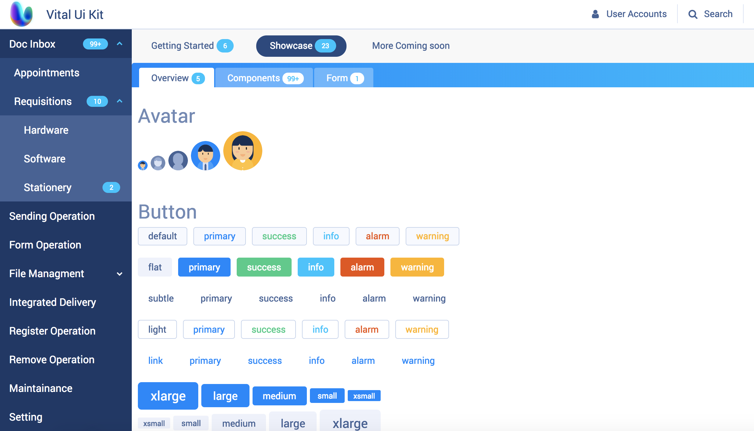
An example of Offical Document contains all Vital UI Kit components
# yarn
yarn add @gssfed/vital-ui-kit-react

# npm
npm i --save @gssfed/vital-ui-kit-react
// ThemeProvider contains default theme and icon, you can override it.
import { Button, ThemeProvider } from '@gssfed/vital-ui-kit-react'
// recommend importing the global style.
import '@gssfed/vital-ui-kit-react/dist/global.css'
/* ... */
render() {
return (
<ThemeProvider theme={YOUR_CUSTOM_THEME} icon={ICON}>
<Button>Vital 💜 React!</Button>
</ThemeProvider>
)
}Make sure read our contributing guide to learn about our development process.
- docs
- layout
- box
- Table(page, checkbox, input, header)
- Calendar